In CSS we have a lot of keywords to describe physical position: left and right, top and bottom. Let’s take the next image for example:
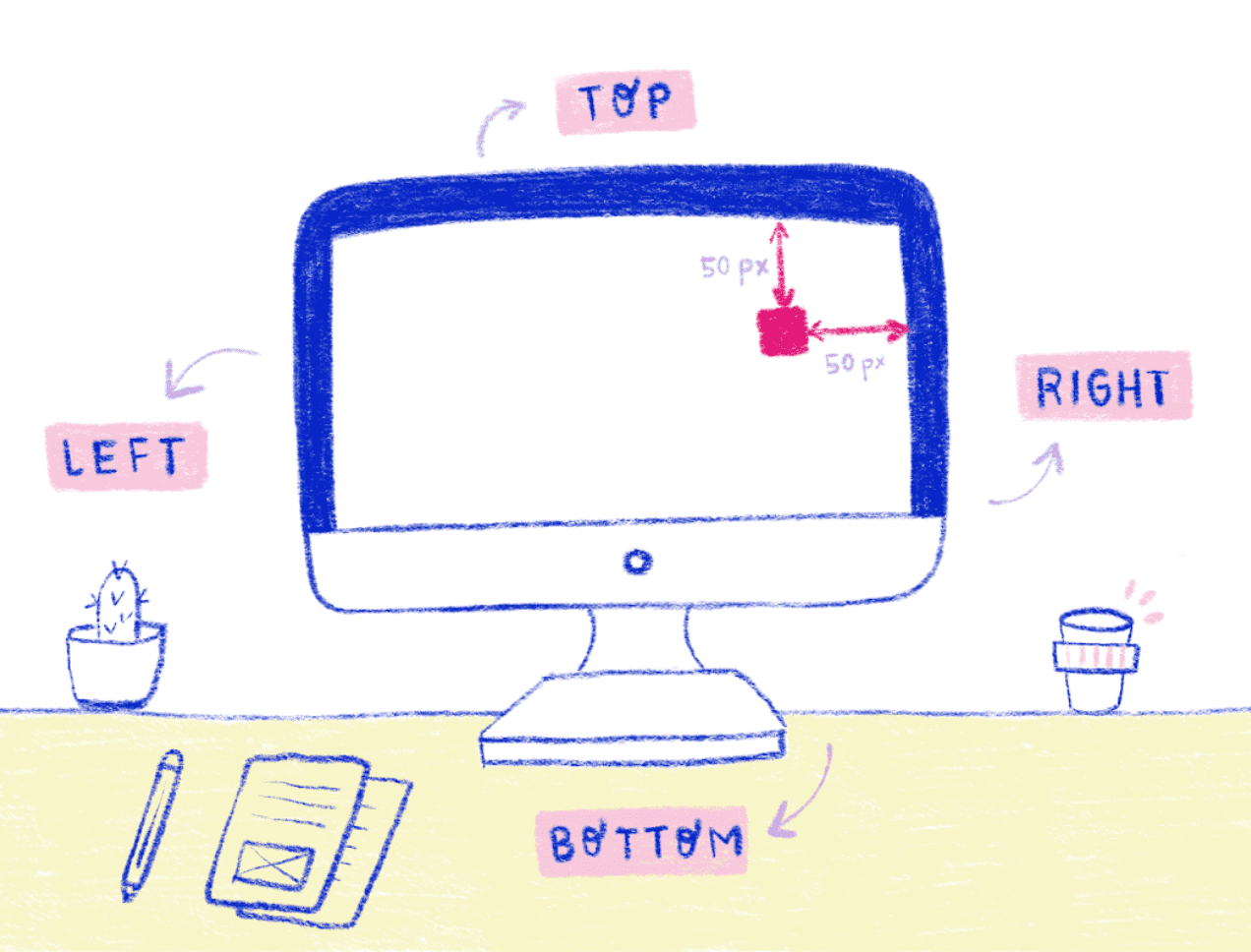
If we want to move an element on the screen we would use a container with a relative position, the element with absolute position, top 50px and right 50px.
Table of contents
- Systems that write from left to right
- Systems that write from right to left
- Systems that are Bidirectional
- Systems that are vertical
- writing-mode: horizontal-tb
- writing-mode: vertical-rl
- writing-mode: vertical-lr
- writing-mode: sideways-rl
- writing-mode: sideways-lr
- Compatibility
- A new approach to layout
- The way of thinking in CSS Logical Properties
But, of course moving an element is not the only thing that we want to do, we also need to work with other physical properties such as: margin-top, border-bottom, padding-left. These properties come naturally when we are working in an english writing system.
For us, the origin in a web page is top-left, because we write from left to right. But, have you ever thought about how our layout would look in a different writing system? in a different alphabet?
For example, in Arabic, Hebrew and Persian, they write from right to left, and the origin of their screen is top-right. So, what you would see on the left side in english writing mode would be on the right side in these writing modes. Consequently, working with physical properties can become a problem if we want our webpage to work in many languages.
Free eBook
Directives, simple right? Wrong! On the outside they look simple, but even skilled Angular devs haven’t grasped every concept in this eBook.
-
 Observables and Async Pipe
 -
 Identity Checking and Performance
 -
 Web Components <ng-template> syntax
 -
 <ng-container> and Observable Composition
 -
 Advanced Rendering Patterns
 -
 Setters and Getters for Styles and Class Bindings
I just mentioned the words “writing modes”, but I want us to look at how this specification works and what we can gain from it. These writing modes can help us better understand CSS Grid and the work involved in creating a web page in a new language.
The writing modes affects both the organization and the directionality of our layout, so the writing mode is the first building block of each design that we create. CSS is able to support many different international writing systems:
Systems that write from left to right
Such as the Latin’s. This is the most commonly used writing system in the world today, with more than two thousand five hundred million users.
Systems that write from right to left
Such as Arabic writing systems- This is the second most commonly used alphabet around the world. It it used in many languages around the middle east, Asia and Africa.
Systems that are Bidirectional
These are a combination of Latin and Arabic alphabets.
Systems that are vertical
Such as Asian characters.
Because CSS support all these languages, there are 5 posible writing mode options.
writing-mode: horizontal-tb;
writing-mode: vertical-rl;
writing-mode: vertical-lr;
writing-mode: sideways-rl;
writing-mode: sideways-lr;
This property can be applied to all elements except the following:
- Table row groups.
- Table column groups.
- Table rows.
- Table columns.
A writing mode in CSS is determined by the properties of:
writing-mode
direction
text-orientation
It is mainly defined in terms of it is:
- Inline Base Direction
- Block Flow Direction
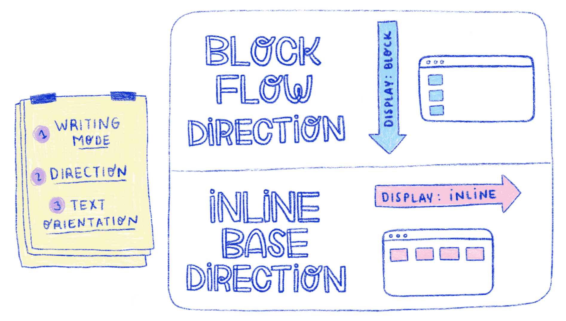
So, let’s look al it in CSS words. If you have work with CSS before, you might be familiar with display: block and display: inline.
If we are in the default writing mode, we will see that by using display:block all the elements will be placed vertically from the top to the page to the bottom. This will be the block flow direction.
Now, if we use display: inline we will see that the elements are placed side by side from left to right. This will be the inline base direction which indicates how we read and write. Both block and inline concepts will help us understand the CSS Logical Properties ahead.
Let’s take a look at some examples for different values:
writing-mode: horizontal-tb
horizontal-tb is the inicial value. The text is displayed from left to right, with a block flow direction from top to bottom. Both the writing mode and the typography mode are horizontal.
writing-mode: vertical-rl
The text is displayed from top to bottom, with a block flow direction from right to left. Both the writing mode and the typography mode are vertical.
writing-mode: vertical-lr
The text is displayed from top to bottom, with a block flow direction from left to right. Both the writing mode and the typography mode are vertical.
writing-mode: sideways-rl
The text is displayed from top to bottom, with a block flow direction from right to left. The writing mode is vertical, but the typography mode is horizontal, and the symbols are placed on the right side.
writing-mode: sideways-lr
The text is displayed from top to bottom, with a block flow direction from left to right. The writing mode is vertical, but the typography mode is horizontal, and the symbols are placed on the left side.
Compatibility
It’s important to consider the compatibility between writing-mode property and browser. In the next table from can i use we can see which browsers are compatible with the writing-mode property.
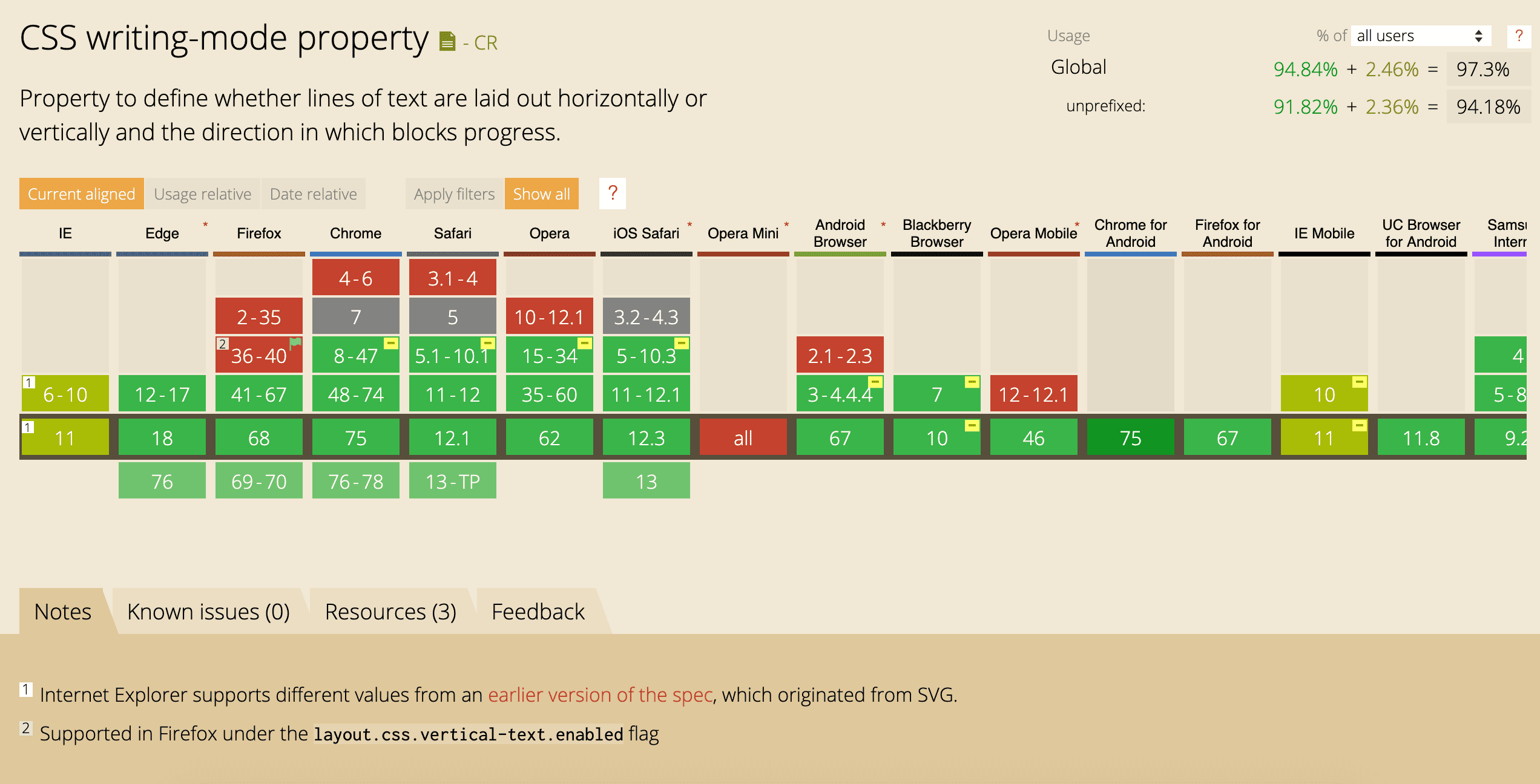
Everything shown in green is the supported version but in some versions of Firefox, Chrome, Safari, etc, the color red indicates it is not supported yet. Another consideration is that some versions need a prefix like -webkit- or -ms- to be able to use the writing mode property.
Another important property of writing-mode is direction. The direction property defines how inline content (such as characters in a paragraph) flow on the screen. It can have two values:
- The first one is the default which is left-to-right.
- The other one is right to left.
CSS Logical Properties automatically map layouts to the content direction set with the direction and writing-mode properties.
A new approach to layout
Before, we used physical positions to build layouts but more recently, we have started using a new approach to building layouts: Flexbox and CSS Grid.
Let’s take a deeper look into Flexbox and the logic involved.
Flexbox
Flexbox, does not take into account physical dimensions such as left, right, top, and bottom. It uses values like flex-start and flex-end. These values rely on the direction of the main and cross axes which we use in Flexbox. This is better because concepts like “start” and “end” are relative in Flexbox and can easily be flipped.
Here we have an example of Flexbox in action:
The first thing that you need to do to create this example is define the container with display: flex. By default, all the elements are placed side by side from left to right in an english writing system. If we need the elements to be placed vertically, we need to add another property to the container: flex-direction.
We need to keep in mind that Flexbox is a single-direction layout concept. That is, the elements can be placed in horizontal rows or vertical columns. For this reason, flex-direction has four different values:
- Row: This is the default value and depends on the direction of the writing mode. If you are in al LTR direction you can see the elements placed side by side from left to right but, if you are in an RTL direction you can see the elements placed side by side from right to left.
- Row-reverse: This is similar to the row concept but in this case if you are in an LTR direction you can see the elements placed side by side from right to left and if you are in an RTL direction you can see the elements placed side by side from left to right.
- Column: This is the same as the row element but placed from top to bottom.
- Column-reverse: This is the same as row-reverse but it changes to bottom to top.
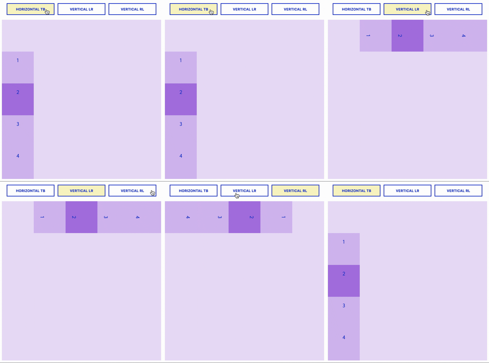
With only these two properties display: flex and flex-direction we can see the magic in the next example when the writing-mode property changes to horizontal-tb, vertical-lr and verical-rl values. In Flexbox, the behavior of the alignment depends on the flex-direction property. For example, justify-content aligns the elements horizontally if flex-direction property is row or row-reverse, but vertically if flex-direction is column or column-reverse.
This is the real beauty of Flexbox and this is the beginning of the logical concepts in our layout. The justify-content property can take five values:
flex-start
flex-end
center
space-between
space-around
But, let’s focus on the first to: flex-start and flex-end. In this example you can see that start and end concepts change depending on the writing-mode property.
CSS Grid
After Flexbox, the most powerful layout system available in CSS appeared: CSS Grid. CSS Grid is a two-dimensional system created specifically to solve the layout problems we’ve been hacking for a long time.
CSS Grid doesn’t know left, right, top and bottom. Basicly, CSS Grid follows the same logic as Flexbox. You can define the position of Grid items with properties such as grid-row-start, or with named grid areas using the grid-template-areas property.
Similarly to Flexbox, CSS Grid also has logical properties instead of physical ones. Let’s take a look at one example:
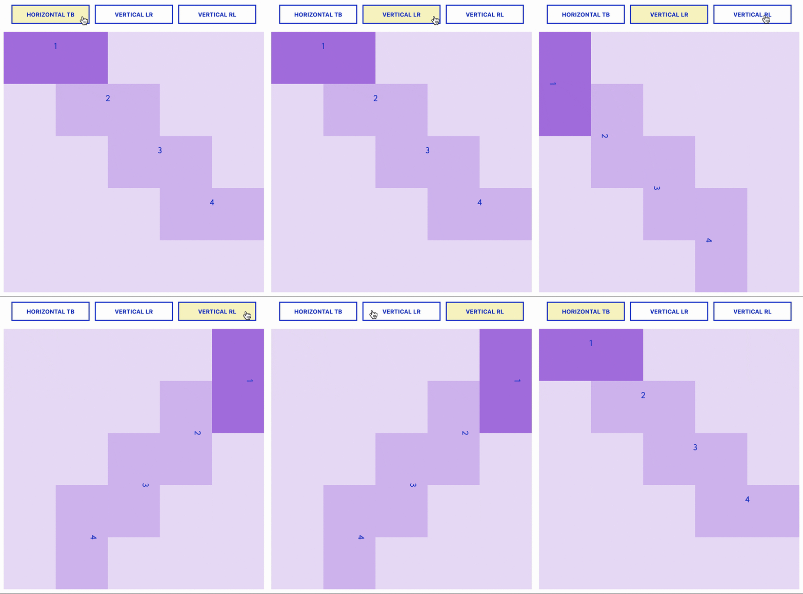
To get started, you have to define a container as a grid with display: grid and set the column and row sizes with grid-template-columns and grid-template-rows. To place the children into the grid, we need to define each element with:
grid-column-start: 1;
grid-column-end: 2;
grid-row-start: 1;
grid-row-end: 2;
or use a shorthand:
grid-column: start / end;
grid-row: start / end;
The way of thinking in CSS Logical Properties
A very important them in CSS is the Box Model. We are used to the Box Model shown on the left side of the next example this is not wrong, it is still correct; but in order to use the CSS Logical Properties, we must stop thinking in terms of: left, right, top and bottom and replace them with: inline-start, inline-end, block-start and block-end. You can see this change in the second box model.
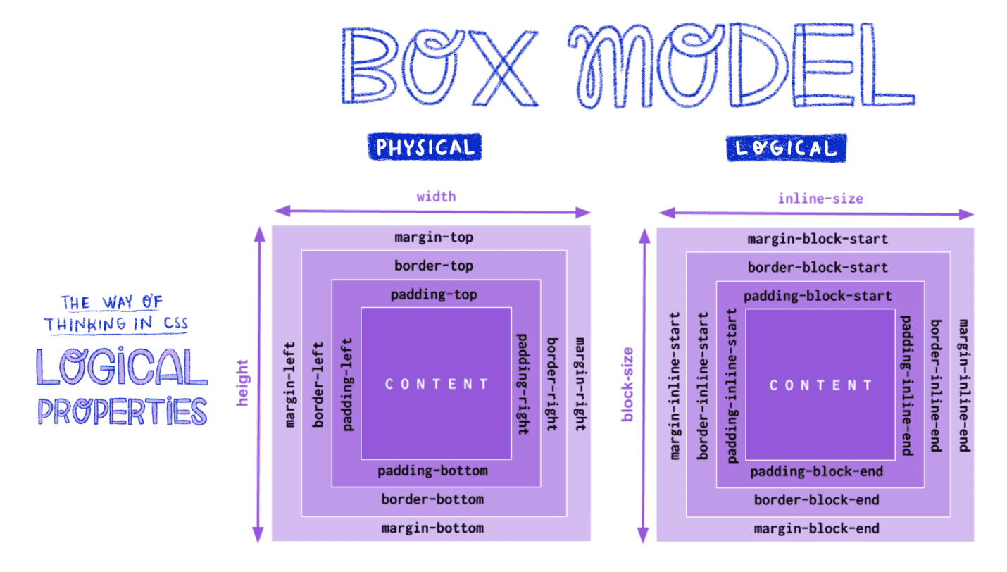
Block and Inline
Now, we return to these two concepts: block and inline. When we work with Logical Properties, we start to understand the block and inline axis. As we shift to this way of thinking our layout begins to make more sense. Now, our logical properties will be like the list shown below:
margin-{block, inline}-{start, end}
padding-{block, inline}-{start, end}
border-{block, inline}-{width, style, color}
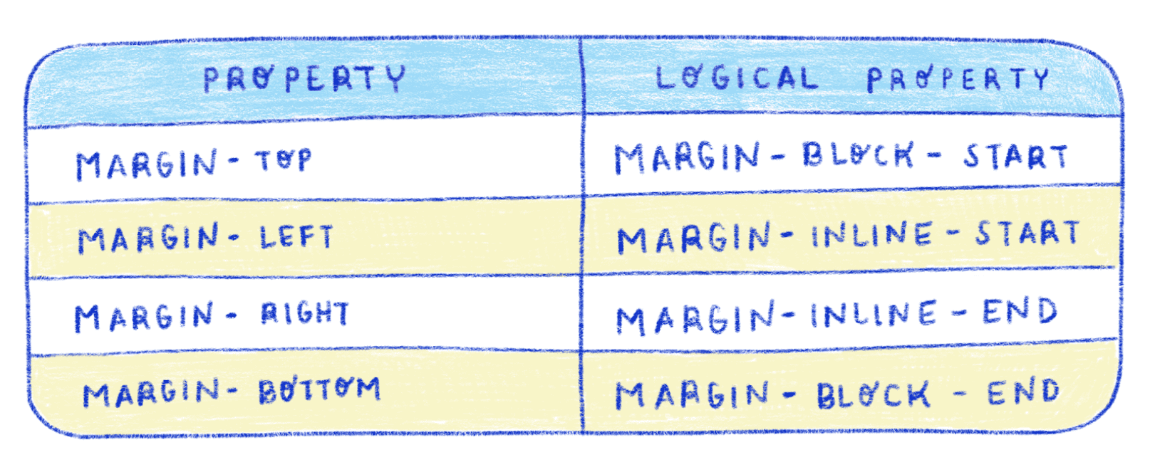
Margins
On the left you see the name of the properties as used in the old Box Model. On the right you will find their equivalent in the new Box Model.
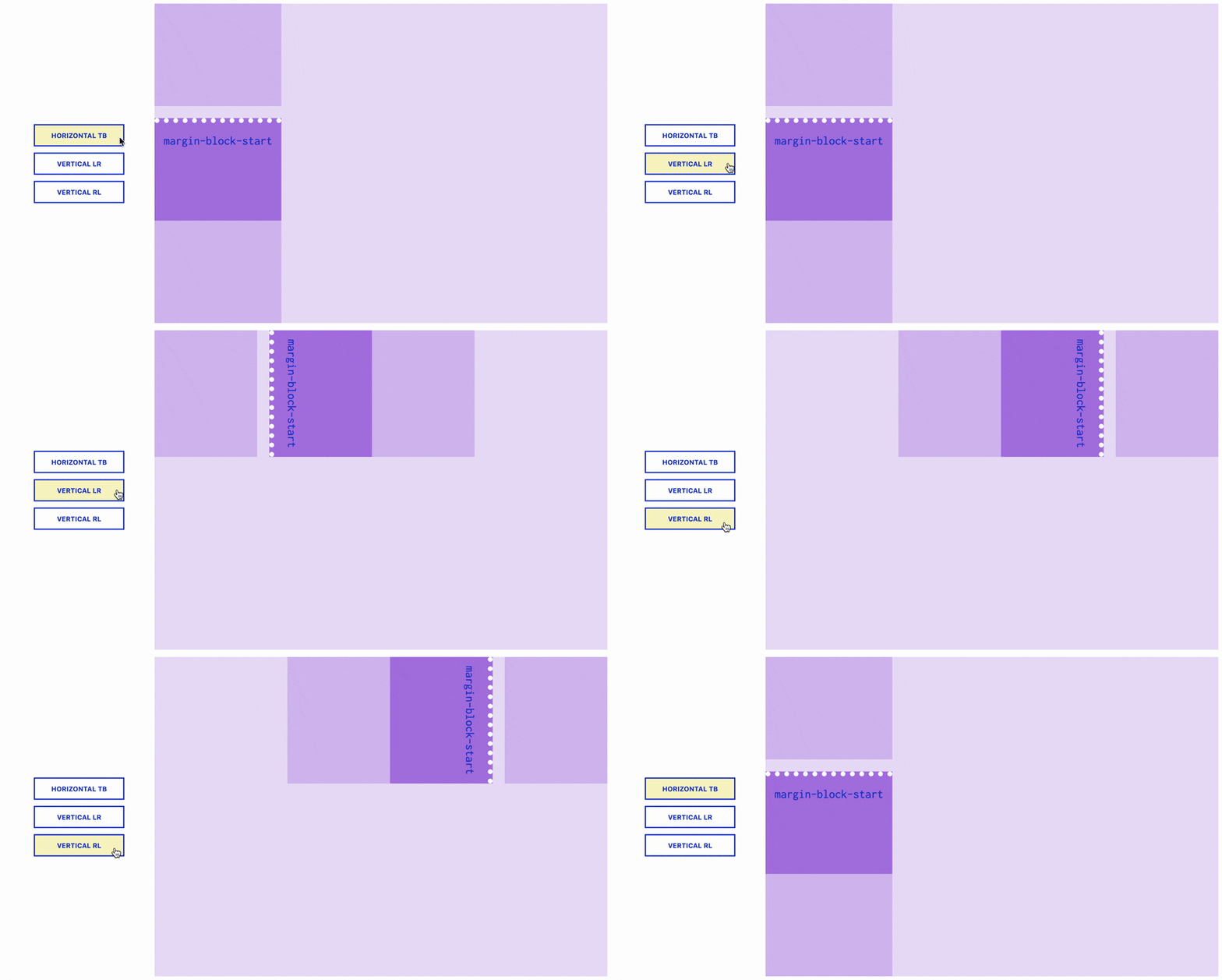
The next is and example of margins. In this case I used margin-block-start property and we can see how it changes when writing mode changes. You will want to keep your eye on the space between the blocks.
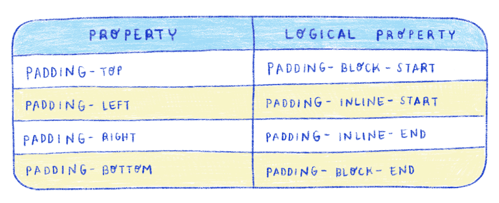
Paddings
On the left you see the name of the properties as used in the old Box Model. On the right you will find their equivalent in the new Box Model.
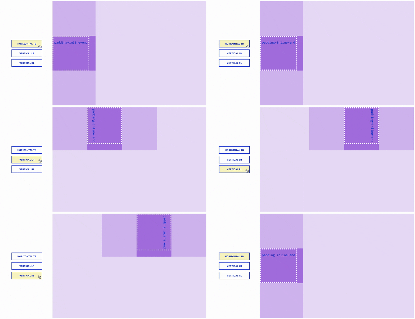
The next is and example of paddings. Again, you can see how padding changes when writing mode changes. The container here is shown in dark purple and the child is represented by the white dots. The dark purple outside of the white dots is the padding.
Borders
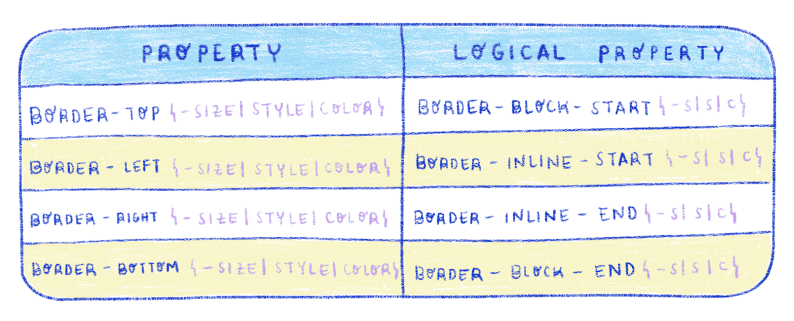
On the left you see the name of the properties as used in the old Box Model. On the right you will find their equivalent in the new Box Model.
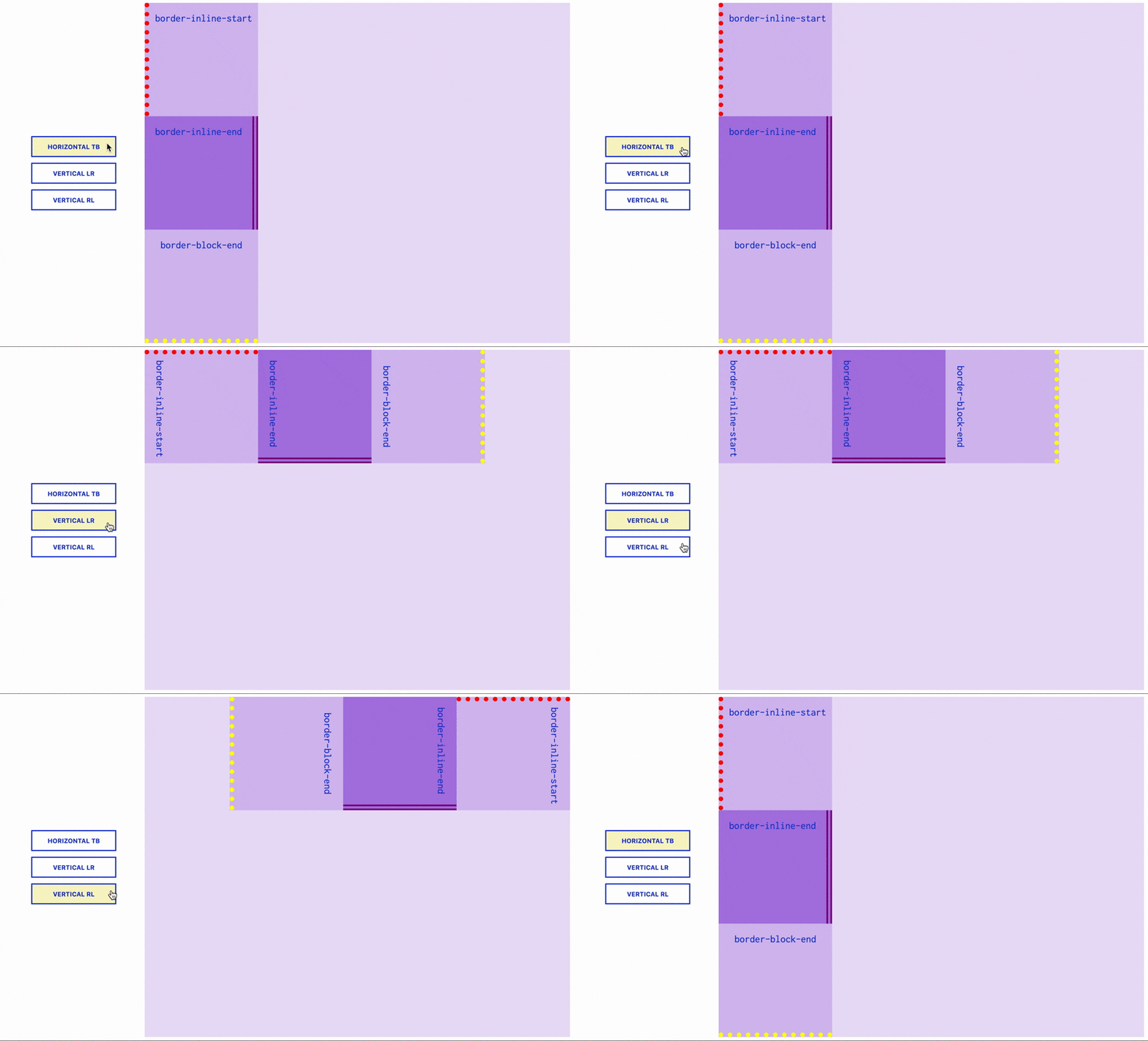
This example of borders might be a little more complicated. The different colors of borders shown here will help you track how they change differently. With the red border I used the border-inline-start property. For the purple border I used the border-inline-start property. And for the yellow border I used the border-block-end.
Positions
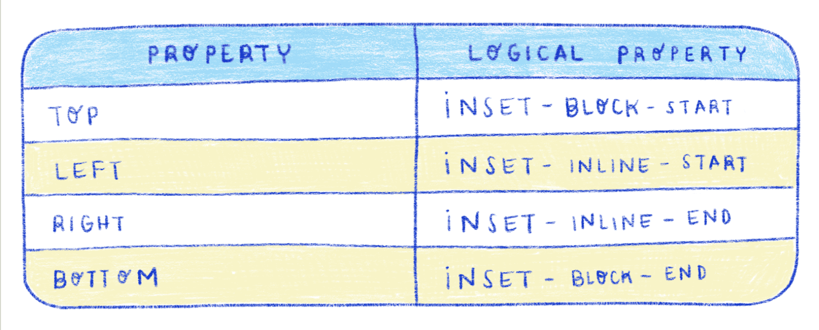
On the left you see the name of the properties as used in the old Box Model. On the right you will find their equivalent in the new Box Model.
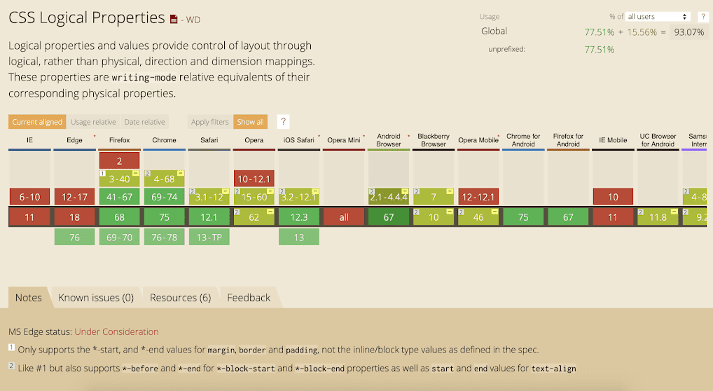
Compatibility
Just like writing-mode, the compatibility is important. And again, some versions need a prefix.
In conclusion, we need to think of ways to create webpages that are accessible for everyone. Thinking in terms of Logical Properties is a good practice when creating a webpage with multiple languages.

