 Google Developer Expert
 Object-Orientated CSS, or OOCSS to the masses, is a method of structuring your CSS and HTML classes in a specific way. The purpose of OOCSS is to make code more easily usable, and more importantly – reusable. It can help trim down your stylesheets and you start to think about the object you’re creating and not just the elements inside. This theory (done right) makes your stylesheet more efficient.
By writing this post, I do not promote the use of OOCSS for every project, or completely side with it’s lack of HTML class semantics, though one thing’s for sure, it’s awesome.
Table of contents
Why OOCSS has it’s place now
Prior to CSS3 gradients, box-shadows, border-radius and other fancy features, we used to make buttons from a simple image. Now, however, the tables have turned quite drastically, and a simple button’s markup has turned into a vendor prefix battle for clean code and white space. CSS looks messy with vendor prefixes, and I think OOCSS is the key to minimising it’s load, by splitting and sharing properties.
Without OOCSS
Before we start to ‘think’ OOCSS, let’s look at how a basic button might look in regular HTML/CSS on a typical website:
<a href="#" class="button-blue">Click me!</a>
<style>
.button-blue-small {
  display:inline-block;
  zoom:1;
  vertical-align:bottom;
  text-align:center;
  margin:10px 5px;
  border-radius:3px;
  text-decoration:none;
  font-weight:900;
  font-family:'Helvetica Neue', Helvetica, Arial, sans-serif;
  text-shadow:0 1px 1px rgba(0,0,0,0.5);
  box-shadow:0 1px 3px rgba(0,0,0,0.3),inset 0 1px 0 rgba(250,250,250,0.4);
  -webkit-box-shadow:0 1px 3px rgba(0,0,0,0.3),inset 0 1px 0 rgba(250,250,250,0.4);
  -moz-box-shadow:0 1px 3px rgba(0,0,0,0.3),inset 0 1px 0 rgba(250,250,250,0.4);
  color:#FFF;
  border:1px solid #0082BE;
  background:#00A4EF;
  background-image:linear-gradient(bottom, rgb(0,163,239) 1%, rgb(0,177,241) 51%);
  background-image:-o-linear-gradient(bottom, rgb(0,163,239) 1%, rgb(0,177,241) 51%);
  background-image:-moz-linear-gradient(bottom, rgb(0,163,239) 1%, rgb(0,177,241) 51%);
  background-image:-webkit-linear-gradient(bottom, rgb(0,163,239) 1%, rgb(0,177,241) 51%);
  background-image:-ms-linear-gradient(bottom, rgb(0,163,239) 1%, rgb(0,177,241) 51%);
  font-size:13px;
  padding:5px 20px;
}
</style>
Okay I’ll think you’ll agree, even without the vendor-prefixes it’s a nasty sight. Imagine creating a set of buttons for a few different colours and sizes, and 400 lines of CSS later you’ve done your buttons, ouch! It’ll slow down your CSS performance and also cause maintenance issues and inconsistencies. I myself have even struggled keeping everything in order, and I think OOCSS is the answer to this problem. The idea is that elements share properties, so play nice. I’m not advocating OOCSS for every aspect of your website, we would still like semantics, but for a lot of cases it can be a great idea to use it.
Digging into OOCSS, structure, sizing and style
Let’s look at how we can begin to think about OOCSS right now, and ‘plan’ how our coded objects will appear. I like to split OOCSS into three different areas:
1) Structure – We need to create a base/foundation that all buttons will share, let’s think about building a button shell, to then add sizing and styles on top.
2) Sizing – A good kit of OOCSS elements will consist of easily changeable sizes, small, medium and large for instance.
3) Style – Adding style on top of our structure and sizing is the final piece to complete the object.
Taking the above CSS, we can split it into these areas:
Naming conventions
OOCSS focuses on the ‘object’, which means it steers away from semantic markup to focus on how things are put assembled. Taking an object-styled approach, I believe that OOCSS works best when class names show relation to each other. For instance, instead of throwing together random class names together, we group them around the main objects name. For instance, for a button, we’ll shorten it to .btn, and all other classes will use this as a prefix. For instance, the button colour would look like .btn-blue, feeding off the same prefix. This shows their relationship with the main object we’re revolving our CSS around!
Free eBook
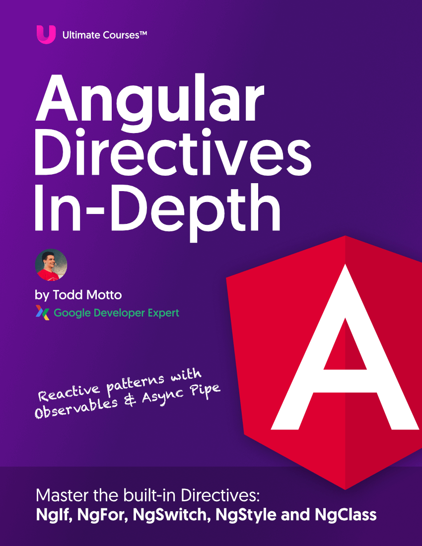
Directives, simple right? Wrong! On the outside they look simple, but even skilled Angular devs haven’t grasped every concept in this eBook.
-
 Observables and Async Pipe
 - Identity Checking and Performance
- Web Components <ng-template> syntax
- <ng-container> and Observable Composition
- Advanced Rendering Patterns
- Setters and Getters for Styles and Class Bindings
 Observables and Async Pipe
 Structure
Keeping CSS selectors as short as possible, for two reasons, CSS maintenance and not overloading the DOM with long class names. Here’s what our structure could look like:
.btn {
  display:inline-block;
  zoom:1;
  vertical-align:bottom;
  text-align:center;
  margin:10px 5px;
  border-radius:3px;
  text-decoration:none;
  font-weight:900;
  font-family:'Helvetica Neue', Helvetica, Arial, sans-serif;
  text-shadow:0 1px 1px rgba(0,0,0,0.5);
  box-shadow:0 1px 3px rgba(0,0,0,0.3),inset 0 1px 0 rgba(250,250,250,0.4);
  -webkit-box-shadow:0 1px 3px rgba(0,0,0,0.3),inset 0 1px 0 rgba(250,250,250,0.4);
  -moz-box-shadow:0 1px 3px rgba(0,0,0,0.3),inset 0 1px 0 rgba(250,250,250,0.4);
}
Let’s talk through this line-by-line:
1) display: inline-block; allowing them to sit next to each other
2) zoom: 1; an IE hack-trick to activate ‘hasLayout’ (allowing display:inline-block to work)
3) vertical-align: bottom; the button will always sit at the bottom of the line they are on
4) text-align: center; to center our text and not rely on padding to centralise
5) margin: 10px 5px; for spacing above, below and aside each button
6) border-radius: 3px; to round our corners slightly
7) text-decoration: none; to remove any underlining on our hyperlink
8) font-weight: 900; which bolds our font
9) font-family: ’Helvetica Neue’, Helvetica, Arial, sans-serif; to serve better fonts and fallbacks
10) text-shadow: 0 1px 1px rgba(0,0,0,0.5); to add a semi-transparent drop shadow on text, this also avoids specifying a specific colour for each button, saving more lines of code
11, 12, 13) box-shadow: 0 1px 3px rgba(0,0,0,0.3),inset 0 1px 0 rgba(250,250,250,0.4); alongside the prefixed versions, we add the semi-transparent drop shadow. You’ll notice there’s two parts to this, the box-shadow and a comma separating the inset property. The inset part creates an inset drop-shadow, which is semi-transparent white to add a nice finish to the button.
A pretty good foundation for our button starting point.
Sizing
Now we’re onto the sizing, we’ll want to create a few different sizes of buttons, so we’ll name our button sizes, let’s call this one our small button:
.btn-small {
  font-size:13px;
  padding:5px 20px;
}
Nice and easy. You could use em for your unit sizes, though it depends on your project.
This now gives us an easy grounding to then add ‘medium’ and ‘large’ buttons.
Style
Let’s give our button the lick of paint it needs, here I’ve ripped out the font colour, the background, and border colour:
.btn-blue {
  color:#FFF;
  border:1px solid #0082BE;
  background:#00A4EF;
  background-image:linear-gradient(bottom, rgb(0,163,239) 1%, rgb(0,177,241) 51%);
  background-image:-o-linear-gradient(bottom, rgb(0,163,239) 1%, rgb(0,177,241) 51%);
  background-image:-moz-linear-gradient(bottom, rgb(0,163,239) 1%, rgb(0,177,241) 51%);
  background-image:-webkit-linear-gradient(bottom, rgb(0,163,239) 1%, rgb(0,177,241) 51%);
  background-image:-ms-linear-gradient(bottom, rgb(0,163,239) 1%, rgb(0,177,241) 51%);
}
What have we created?
Looking at our CSS now, we can see we’ve created the following:
.btn {} /* Button structure */
.btn-small {} /* Button sizing */
.btn-blue {} /* Button colour */
Our HTML would then look like this:
<a href="#" class="btn btn-small btn-blue">Click me!</a>
I think this is perfectly acceptable class usage, very neat and tidy. You might argue the button isn’t semantic as it’s not telling us anything about it’s role, but the benefits to using OOCSS in this instance far outweigh a ‘non-semantic’ button.
What you want to avoid here, is mixing your HTML classes:
<a href="#" class="btn btn-small btn-blue">Click me!</a>

<a href="#" class="btn-blue btn-small btn">Click me!</a>

<a href="#" class="btn btn-blue btn-small">Click me!</a>
The above would be a bad pattern to follow, so follow the Structure, Sizing, Style and management will become easy.
We also want to avoid overloading the DOM and making life miserable:
<a href="#" class="btn border box-shadow btn-small btn-blue nice krispykreme">Click me!</a>
Putting it into practice
Taking the principles we’ve learned from this tutorial, we can begin to create our own OOCSS button kit.
Structure:
.btn {
  display:inline-block;
  zoom:1;
  vertical-align:bottom;
  text-align:center;
  margin:10px 5px;
  border-radius:3px;
  text-decoration:none;
  font-weight:900;
  font-family:'Helvetica Neue', Helvetica, Arial, sans-serif;
  text-shadow:0 1px 1px rgba(0,0,0,0.5);
  box-shadow:0 1px 3px rgba(0,0,0,0.3),inset 0 1px 0 rgba(250,250,250,0.4);
  -webkit-box-shadow:0 1px 3px rgba(0,0,0,0.3),inset 0 1px 0 rgba(250,250,250,0.4);
  -moz-box-shadow:0 1px 3px rgba(0,0,0,0.3),inset 0 1px 0 rgba(250,250,250,0.4);
}
Sizing:
.btn-small {}
.btn-medium {}
.btn-large {}
Styles:
.btn-blue {}
.btn-dark-blue {}
.btn-dark-grey {}
.btn-salmon {}
.btn-orange {}
.btn-mint {}
.btn-pink {}
.btn-purple {}
.btn-yellow {}
.btn-white {}
HTML output
After defining some styles for each of the above classes, we can put together our buttons.
Let’s create a button, small size, that’s salmon colour:
<a href="#" class="btn btn-small btn-salmon">Click me!</a>
Let’s create a button, medium size, that’s mint colour:
<a href="#" class="btn btn-medium btn-mint">Click me!</a>
Let’s create a button, large size, that’s purple:
<a href="#" class="btn btn-large btn-purple">Click me!</a>
You get the point. You can see how scalable OOCSS is, and the power it has when working with somewhat complex objects.
Cutting down vendor prefixes and pseudo
You’ll notice in the demo that the only :hover pseudo class I’ve used is on the .btn class! I’ve applied an opacity to the class, so that on hover we do actually see a different in hover state, without defining any further styles. I don’t want to triple the code with hover and active styles for each button colour as we want it to perform well and be manageable. Here’s the neat trick I’ve used:
.btn:hover {
  opacity:0.7;
}
Workflow
It may take a little more time to setup your styles, but time saved in management and the long run is impeccable. My suggested workflow is to create the button like in the first code snippet, all as one, and then divide it into it’s selected portions, following the SSS principles. From there, you can begin to create the variant styles based on your three foundations.