 JavaScript
 Google Developer Expert
 Ready to build an iOS weather app clone in a few minutes? By doing so we’re going to master NativeScript layouts by demonstrating some common patterns that will be super useful in your every day development.
NativeScript provides an extremely flexible and versatile engine for laying out your app’s UI. It focuses heavily on reusing your web skills to create mobile apps, so they have created a markup that closely resembles XML and HTML, so you will likely feel really comfortable working with NativeScript layouts if you’re somewhat dangerous with HTML ;)
Table of contents
The Basics
When creating an app, its extremely important to design for devices of all sorts of shapes and sizes. NativeScript provides a bunch of different layout containers to achieve a flexible UI for any situation. NativeScript has some nice documentation on their layout containers here, but illustrate the capabilities with apps that look like this:
That app looks super useful, but we are going to try and illustrate the deeper power of layout containers and how you can achieve sophisticated UI using simple markup.
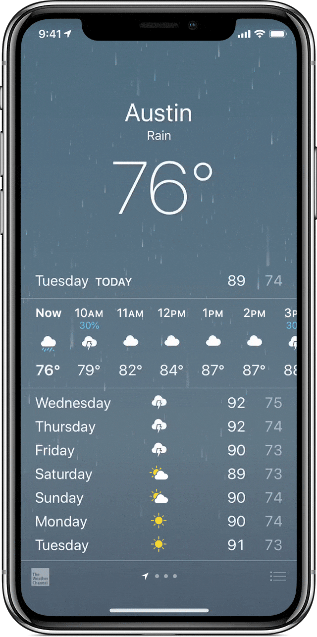
I’m going to demonstrate how to use layouts to create sophisticated UI by rebuilding the layout of a popular app…the stock weather app on iOS.
First, let’s start by bootstrapping a simple NativeScript Angular app. Open terminal and type tns create. The NativeScript CLI will walk you through your options. Give it a name, choose Angular as the flavor, and choose the Hello World template. This sets up a simple app with a list of soccer players, and a detail view for each player. We’ll just clear out the items.component.html file and use this file to create our clone weather app.
The weather view has a section at the top with the location, the weather and the temperature. Then theres a section with today’s hourly details, and the weather for the next 7 days. So there are really 3 different sections in the app. The right layout to use for the main view is GridLayout.
GridLayout
<GridLayout rows="*, auto, auto">

</GridLayout>
GridLayout is a layout that creates columns and rows for other views to exist in. The markup above defines a GridLayout that will take up the whole screen, and have 3 rows. We didn’t define any columns, so it will just have one column that takes up the whole screen. The first row (*) takes up the remainder of the screen, so any available screen left after the next two rows measure. The next two rows (auto) mean the rows will be the size of the content’s height. So this app will have a nice large top area for the current weather no matter what device we are on.
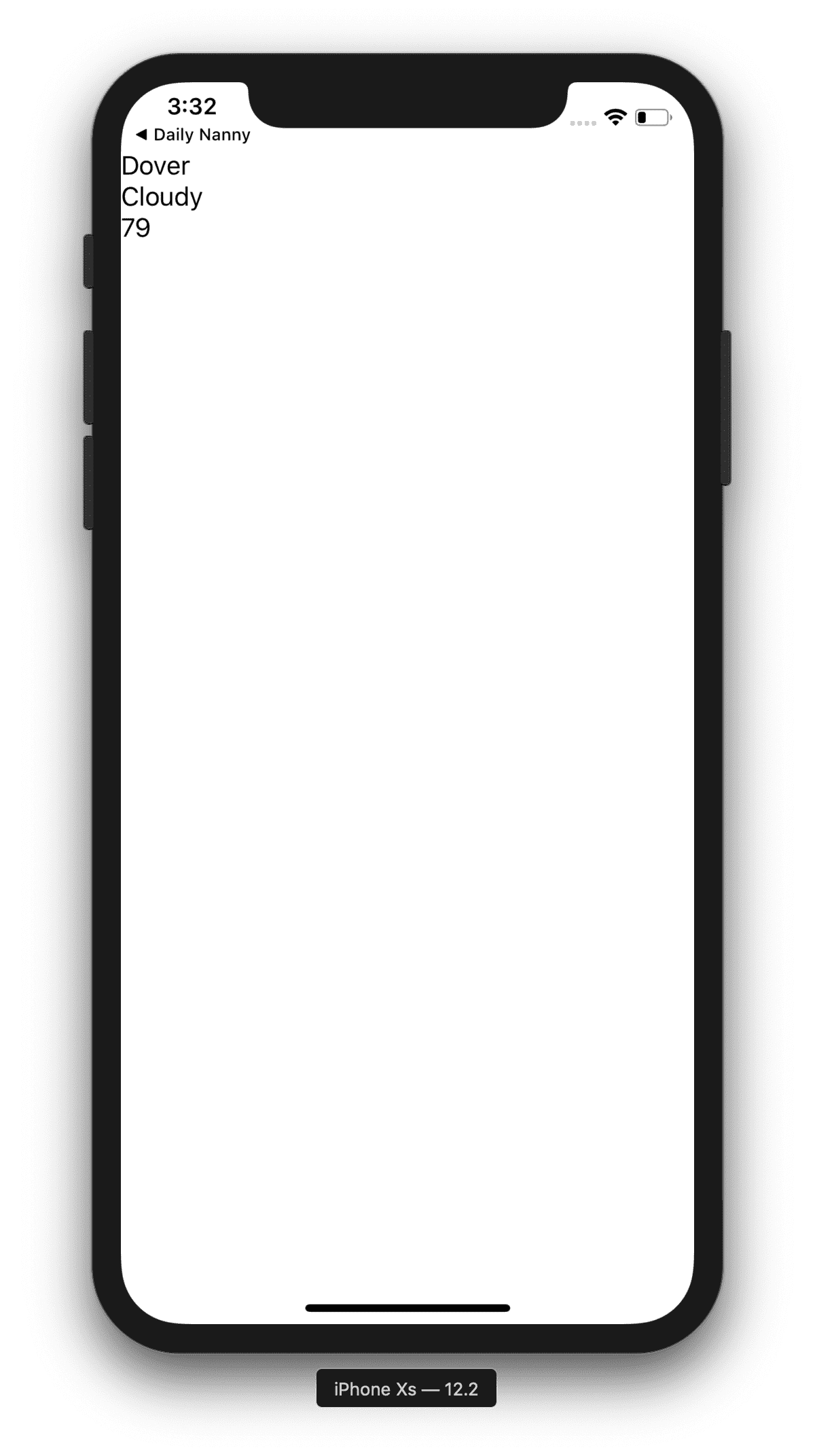
StackLayout
<GridLayout rows="*, auto, auto">
  <StackLayout>
    <Label text="Dover"></Label>
    <Label text="Sunny"></Label>
    <Label text="79"></Label>
  </StackLayout>
</GridLayout>
The next layout we’ll utilize is StackLayout. This layout simply stacks views on top of one another. It also has a property orientation which if set to horizontal will stack views left to right. With the markup above, we have created the first row of our weather app. It may not look great yet, but we are utilizing NativeScript layouts to display data in our app, and that’s pretty cool!
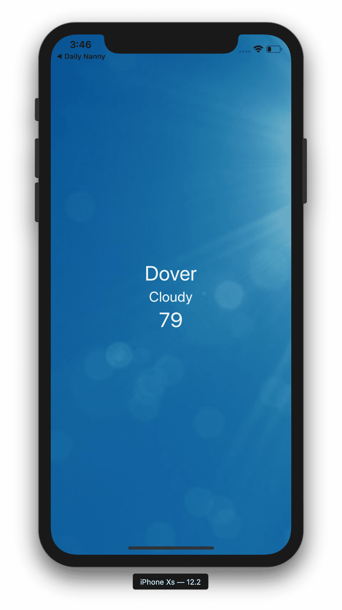
So that doesnt really excite me much. I want the apps I make to look good as I go, so before we get too far lets pretty this up a little bit. All this data is hardcoded, I will get into the data layer in another blog, so we get to decide what the weather is. Lets pretend its 79 and sunny. The background image of our app will represent the current weather, so lets find a nice sunny image.
<GridLayout rows="*, auto, auto">
  <Image src="https://s7d2.scene7.com/is/image/TWCNews/1031_nc_sunny_weather_2-1" iosOverflowSafeArea="true" stretch="aspectFill" rowSpan="3"></Image>
  <StackLayout>
    <Label text="Dover"></Label>
    <Label text="Cloudy"></Label>
    <Label text="79"></Label>
  </StackLayout>
</GridLayout>
Here’s an important aspect of how GridLayout works: you can layer views on top of each other. Our image will display under the StackLayout, making the image act as a background image. We set the rowSpan to 3, because we want it to display under all our content. We set iosOverflowSafeArea to true so it displays under the notch and status bar.
Note: right now the first row is taking up the entire screen. Since we haven’t put any content in either of the subsequent rows, they measure to be 0 high since they are set to auto, and the * row uses all available space, in this case the whole screen.
Another problem we have to solve is that the StackLayout is also taking up the whole screen, and the content is at the top. We want the content to be centered in the row. So we are going to do something tricky: change how we set up our rows so that the content in the first row is always in the middle.

Free eBook
Directives, simple right? Wrong! On the outside they look simple, but even skilled Angular devs haven’t grasped every concept in this eBook.
-
 Observables and Async Pipe
 - Identity Checking and Performance
- Web Components <ng-template> syntax
- <ng-container> and Observable Composition
- Advanced Rendering Patterns
- Setters and Getters for Styles and Class Bindings
 Observables and Async Pipe
 rows="*, auto, *, auto, auto
Now we can place our StackLayout with the current weather in the second row so its height will be measured properly, and the 1st and 3rd rows take up the rest of the available real estate. So our other content now will be placed in row 4 and 5.
An important thing about placing content in columns and rows, when indicating which row the content should go in, the rows start at 0.
<GridLayout rows="*, auto *, auto, auto">
  <Image src="https://s7d2.scene7.com/is/image/TWCNews/1031_nc_sunny_weather_2-1" rowSpan="5" iosOverflowSafeArea="true" stretch="aspectFill"></Image>
  <StackLayout row="1">
    <Label text="Dover"></Label>
    <Label text="Sunny"></Label>
    <Label text="79"></Label>
  </StackLayout>
</GridLayout>
Notice how StackLayout is in row #1, meaning it goes in the auto row in the GridLayout.
Let’s add some helper classes and some inline styling so it looks nice. The helper classes come in a default NativeScript app:
<GridLayout rows="*, auto *, auto, auto">
  <Image src="https://s7d2.scene7.com/is/image/TWCNews/1031_nc_sunny_weather_2-1" rowSpan="5" iosOverflowSafeArea="true" stretch="aspectFill"></Image>
  <StackLayout row="1" class="text-center">
    <Label text="Dover" class="h1" style="color: white;"></Label>
    <Label text="Sunny" class="h2" style="color: white;"></Label>
    <Label text="79" class="h1" style="color: white;"></Label>
  </StackLayout>
</GridLayout>
Starting to look pretty good! Now lets drop a Label in each of the other rows just to see what happens…
<GridLayout rows="*, auto *, auto, auto">
  <Image src="https://s7d2.scene7.com/is/image/TWCNews/1031_nc_sunny_weather_2-1" rowSpan="5" iosOverflowSafeArea="true" stretch="aspectFill"></Image>
  <StackLayout row="1" class="text-center">
    <Label text="Dover" class="h1" style="color: white;"></Label>
    <Label text="Cloudy" class="h2" style="color: white;"></Label>
    <Label text="79" class="h1" style="color: white;"></Label>
  </StackLayout>

  <Label text="Hourly data goes here" row="3"></Label>
  <Label text="7 day forecast goes here" row="4"></Label>
</GridLayout>
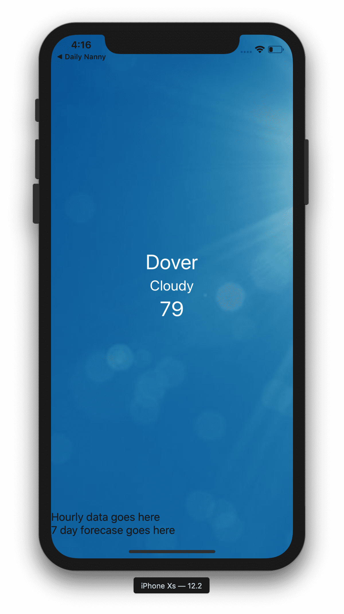
Great, that looks exactly as we’d expect.
Now let’s work on the hourly view.
ScrollView
ScrollView isn’t considered a layout, but is a view you’ll be constantly utilizing in your layouts. We’re going to combine ScrollView with a horizontal oriented StackLayout to achieve this view:
<GridLayout rows="*, auto *, auto, auto">
  <Image src="https://s7d2.scene7.com/is/image/TWCNews/1031_nc_sunny_weather_2-1" rowSpan="5" iosOverflowSafeArea="true" stretch="aspectFill"></Image>
  <StackLayout row="1" class="text-center">
    <Label text="Dover" class="h2" style="color: white;"></Label>
    <Label text="Cloudy" class="h3" style="color: white;"></Label>
    <Label text="79" class="h1" style="color: white;"></Label>
  </StackLayout>

  <ScrollView row="3" orientation="horizontal">
    <StackLayout orientation="horizontal">
      <StackLayout style="color: white; margin: 10; font-size: 13;" class="text-center">
        <Label text="Now"></Label>
        <Image src="https://cdn.pixabay.com/photo/2015/12/03/15/43/sun-1075154_960_720.png" height="20" margin="5"></Image>
        <Label text="79"></Label>
      </StackLayout>
      <StackLayout style="color: white; margin: 10; font-size: 13;" class="text-center">
        <Label text="10am"></Label>
        <Image src="https://cdn.pixabay.com/photo/2015/12/03/15/43/sun-1075154_960_720.png" height="20" margin="5"></Image>
        <Label text="81"></Label>
      </StackLayout>
    </StackLayout>
  </ScrollView>

  <Label text="7 day forecase goes here" margin="50" row="4"></Label>
</GridLayout>
Notice we set the ScrollView as the view that will occupy row #3. You can only have one immediate child of ScrollView, so we set it as our horizontal StackLayout, then we drop in a couple StackLayouts to represent the time, weather icon and temperature. To test out the ScrollView, I’m going to copy a ton of those StackLayouts in the horizontal StackLayout:
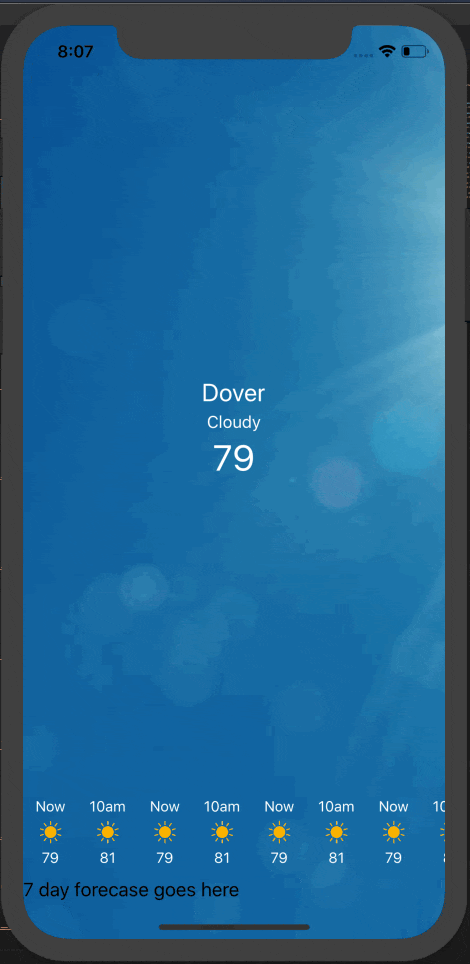
We’re getting pretty close!
To be super clear about the row structure in this app, take a look at this:
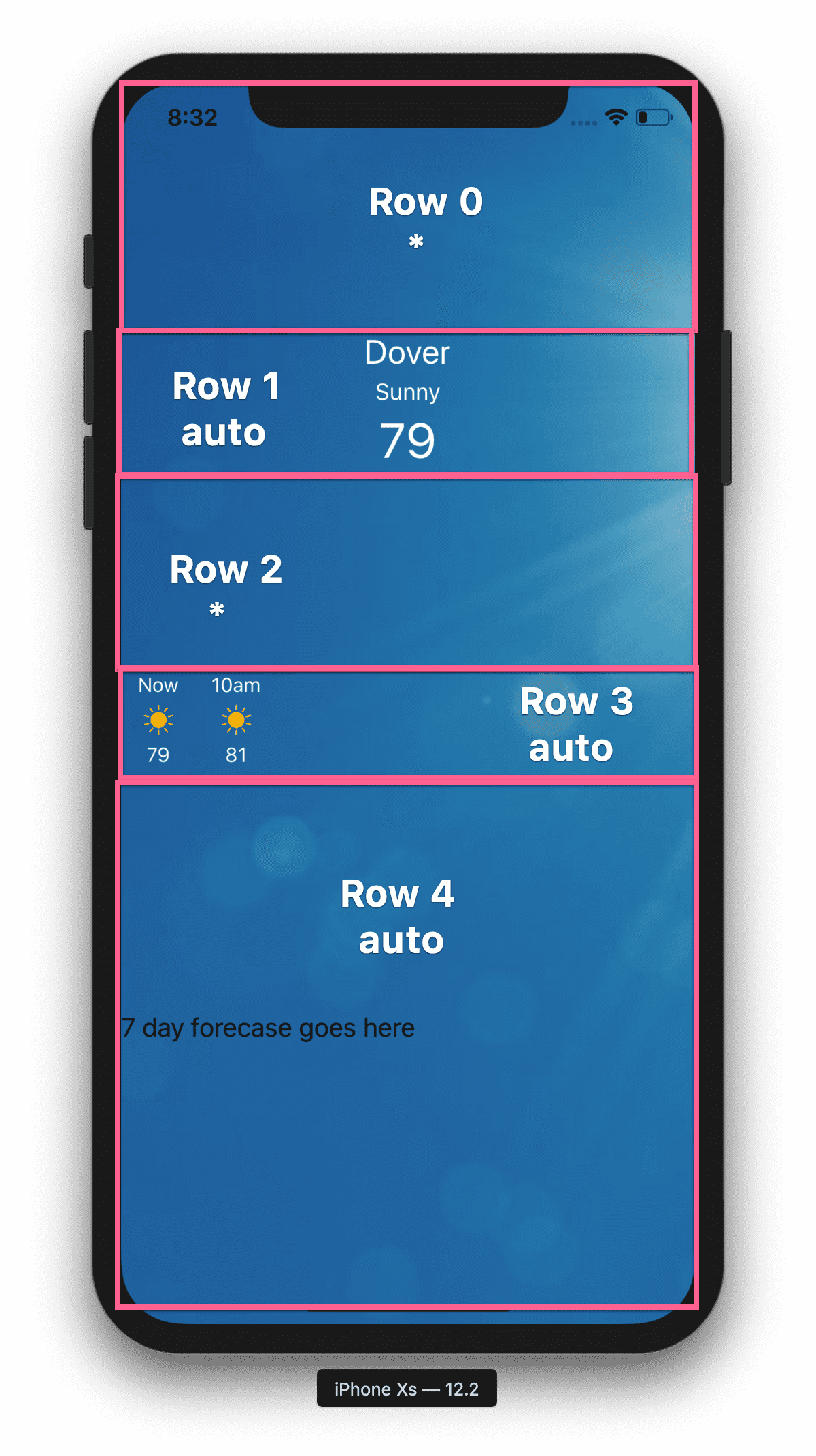
Hopefully that illustrates clearly how we’ve set this app’s primary layout up. Row 0 and 2 are the rows that take up the remainder of the space.
Since this blog is just about layouts, I’m going to hardcode the data. Of course this isn’t how an app like this would work, the hourly data would be provided by an API as an array and binded to the view, but we’ll cover that in another blog. For now I’m going to mock up the UI with hardcoded HTML.
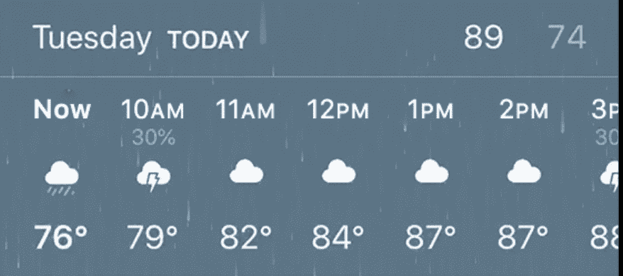
We forgot to add in the High and Low bar right above the horizontal hourly scroller, so let’s add that in. We’ll need to refactor a bit, we can add that to the row where the scroller is just put everything in a StackLayout. Our row 3 becomes this:
<StackLayout row="3">
  <GridLayout columns="auto, *, auto, auto" style="color: white; border-bottom-width: 1; border-bottom-color: rgba(255,255,255,0.2)">
    <Label text="Friday" class="m-x-10 m-b-10"></Label>
    <Label text="TODAY" col="1" class="m-x-10 m-b-10"></Label>
    <Label text="91" col="2" class="m-x-10 m-b-10"></Label>
    <Label text="65" col="3" class="m-x-10 m-b-10" opacity=".5"></Label>
  </GridLayout>
  <ScrollView orientation="horizontal">
    <StackLayout orientation="horizontal">
      <StackLayout style="color: white; margin: 10; font-size: 13;" class="text-center">
        <Label text="Now"></Label>
        <Image src="https://cdn.pixabay.com/photo/2015/12/03/15/43/sun-1075154_960_720.png" height="20" margin="5"></Image>
        <Label text="79"></Label>
      </StackLayout>

      <!--...repeated hourly views go here.-->

    </StackLayout>
  </ScrollView>
</StackLayout>
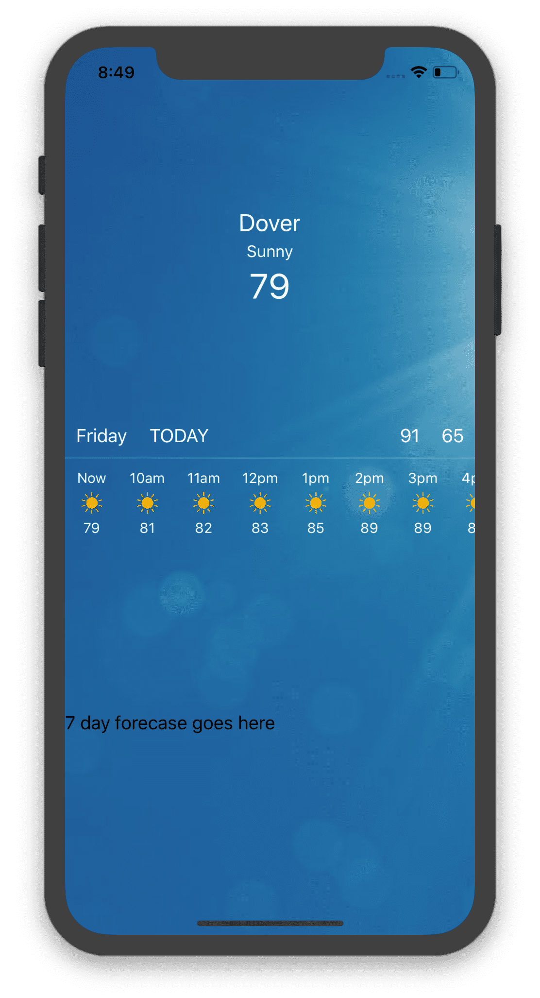
Easy! We used a GridLayout for that bar above the hourly scroller. An important note: if you don’t define row or col for a view in the GridLayout, it will be placed in row 0.
We used helper classes m-x-10 which stands for horizontal margin and m-b-10 which stands for margin bottom.
Ok let’s bang out the week view. We’ll use GridLayout again in the same manner we did above to create those rows like this:
<GridLayout rows="auto" columns="auto, *, auto, auto">
  <Label text="Saturday" class="m-x-10 m-b-10"></Label>
  <Image col="1" src="https://cdn.pixabay.com/photo/2015/12/03/15/43/sun-1075154_960_720.png" height="20" margin="5"></Image>
  <Label col="2" text="88" class="m-x-10"></Label>
  <Label col="3" text="66" class="m-x-10" opacity=".5"></Label>
</GridLayout>
So now we just need to repeat that for the 7 day forecast, and we’re done!
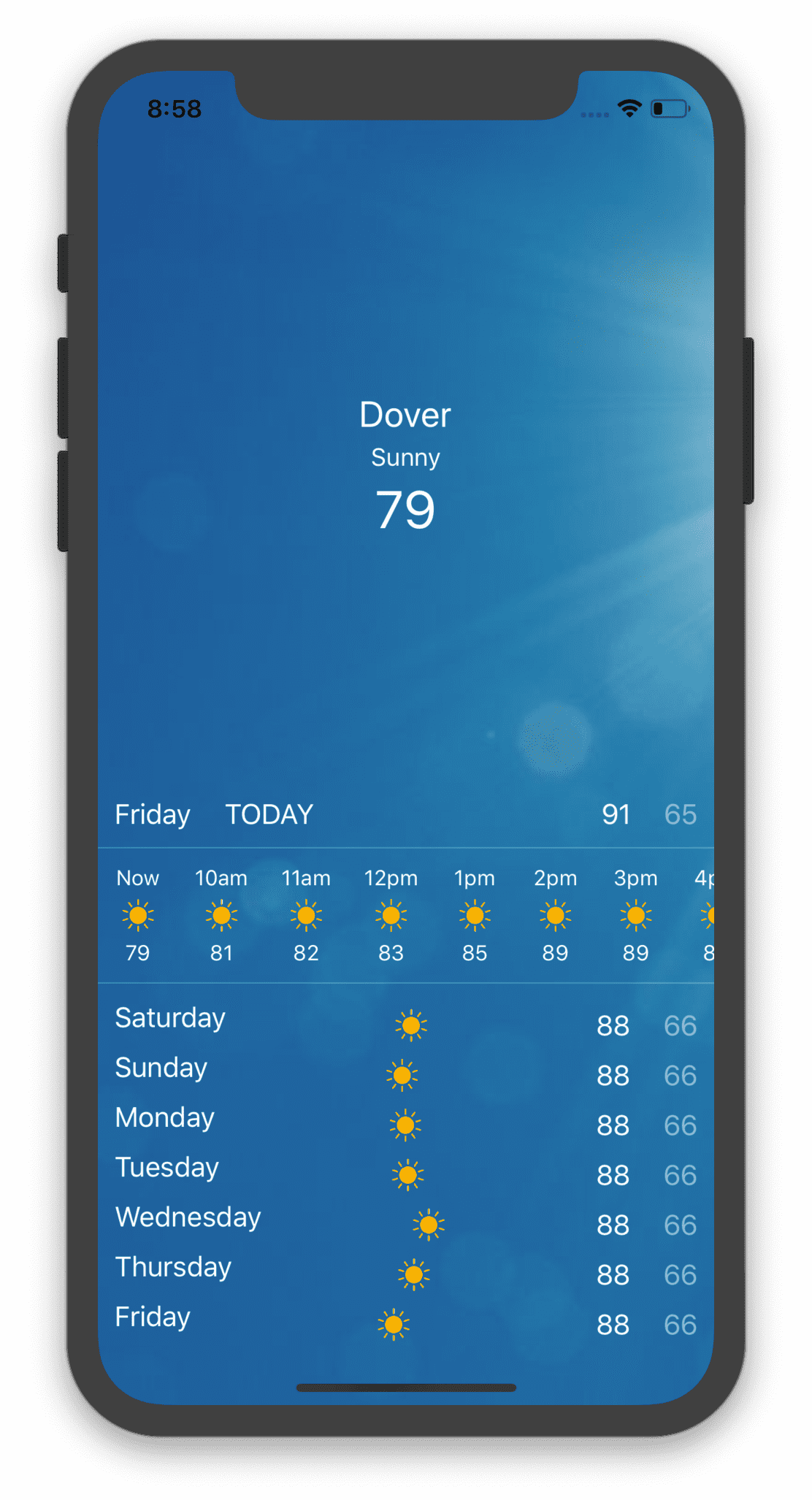
Hmm, wait a minute though, the icons don’t look right. Why? What’s happening is the column that contains the day is being measured based on the content, and the words are different lengths. So the column that contains the icon are different widths for each row. There are a number of ways to solve this, the easiest being to give the day column an explicit width, wide enough for the longest day string. A little bit of experimenting reveals that 120 is a perfect width for that column. But what if its just 1 degree? Or 120 degrees one day? That will also throw off the widths. So we’ll need to give the temp columns an explicit width as well.
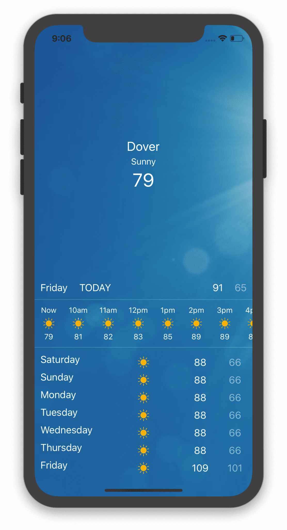
<GridLayout columns="120, *, 60, 60">
  <Label text="Saturday" class="m-x-10 m-b-10"></Label>
  <Image col="1" src="https://cdn.pixabay.com/photo/2015/12/03/15/43/sun-1075154_960_720.png" height="20" margin="5"></Image>
  <Label col="2" text="88" class="text-center"></Label>
  <Label col="3" text="66" class="text-center" opacity=".5"></Label>
</GridLayout>
We added an explicit width to the temp columns, and we removed the margin since the width will be plenty of room for those labels, and used the helper class text-center to center the labels in their column. Looks PERFECT:
Notes
You may have noticed that the only file we edited here was the HTML file. We used helper classes to achieve some styling, but we also added some inline css. That’s obviously not ideal, and would typically utilize class name and scss files to handle our styling. We also hardcoded all the data into the HTML views themselves and did no data binding at all. We will cover that in the next blog.
Honorable Mentions
We only used 2 layouts in the app, and they are the most commonly used layouts. There are layouts for every need though, and you can learn all about them in NativeScript’s official documentation.
Code
You can find all the code for this app here.

