 JavaScript
 Google Developer Expert
 Styling can sometimes be the most challenging aspect to any project. Especially with mobile device form factors and media queries you may need to contend with.
One benefit of NativeScript with regards to using iOS/Android native view components is they are engineered with the device in mind and react (in most cases) naturally well under various form factor conditions. With regards to a tool like NativeScript, the downside is that from a visual perspective iOS/Android have their own unique visual traits which make them more troubling to style consistently from a single point of CSS.
Table of contents
nativescript-theme-core
This is where NativeScript’s core theme can help. It provides a good baseline styling approach (similar to Bootstrap for web components) with regards to achieving more consistent results when styling across iOS and Android.
NOTE: This post will cover nativescript-theme-core 1.x which is still widely in use although recently as of July 2019 a 2.x version has been released. We’ll cover 2.x in a future article however 1.x is still very good and useful today and well into the future with NativeScript.
You can learn more on the official styling docs here. In particular a great overview of Sass integration is explained here.
However I want to show you how to take things a bit farther with the SASS setup to take advantage of the core theme’s flexibility. This setup is what our team at nStudio use in majority of our professional NativeScript projects. Just like with Bootstrap you can utilize bits/pieces of the core theme you want and build on top of it to get great results while keeping your mobile styling maintainable.
When creating a new project with tns create myapp --ng (We’ll use Angular throughout) you’ll have one app.css file. We’re going to switch the project to SCSS to take advantage of some nice styling features.
The Important Index
Let’s start by creating a scss/_index.scss(we create a scss folder in the root of our app to keep things tidy) with the following:
// {N} variables which are used by core theme + our own
@import "variables";

// {N} mixins which are used by core theme + our own
@import "mixins";
@import "animations";

// {N} core theme rulesets (mix/match these to use what you want/need)
@import "~nativescript-theme-core/scss/action-bar";
@import "~nativescript-theme-core/scss/activity-indicator";
@import "~nativescript-theme-core/scss/buttons";
@import "~nativescript-theme-core/scss/icons";
@import "~nativescript-theme-core/scss/forms";
@import "~nativescript-theme-core/scss/labels";
@import "~nativescript-theme-core/scss/list-view";
@import "~nativescript-theme-core/scss/page";
@import "~nativescript-theme-core/scss/progress";
@import "~nativescript-theme-core/scss/segmented-bar";
@import "~nativescript-theme-core/scss/side-drawer";
@import "~nativescript-theme-core/scss/slider";
@import "~nativescript-theme-core/scss/switch";
@import "~nativescript-theme-core/scss/tabs";

// app customizations
@import "action-bar";
@import "fonts";
@import "buttons";

// {N} core theme utilities are additive to any above class, these should always be last
// includes (core theme's color, spacing, and text helpers): https://github.com/NativeScript/theme/tree/c1f8b50cd53f611c58b526cf14955a972d35c787/app/scss/utilities
@import "~nativescript-theme-core/scss/utilities/index";
// our custom convenient additive class utilities
@import "borders";
@import "colors";
@import "spacing";
@import "text";
Variables
It’s always a good idea to have your variables at the very bottom of the style stack so we include those first. Here’s what would go in there:
// core theme ios/android variables here...
@import "~nativescript-theme-core/scss/variables";

// Our apps custom variables

// colors
$light: #efefef;
$gray: #6d6d6d;
$active: #2d94e3;

// text sizes
$large-text: 20;
$medium-text: 16;
$small-text: 12;
We include the core theme’s variable set as a nice baseline set which you can always reference here. We then add our own custom variables for anything we want to standardize across our app.
Mixins
We then add a layer of mixins next. This is important because it also includes the mixins needed by the rest of the core theme layers we add below them. This gives us an opportunity to also keep all the mixins we want for our app nice and tidy as well.
@import "~nativescript-theme-core/scss/mixins/index";

@mixin fontbrandon($weight: 300) {
  font-family: "Brandon Text";
  font-weight: $weight; // 300: light, 400: normal, 500: 700: bold, 800: black
  vertical-align: center;
}

@mixin fontsfpro($weight: 300) {
  font-family: "SF Pro Display";
  font-weight: $weight; // 300: light, 400: normal, 500: medium, 700: bold
  vertical-align: center;
}
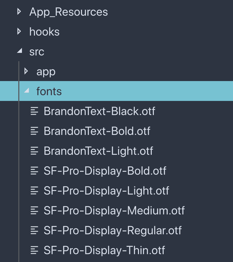
Of course you can have all sorts of sophisticated mixins but this is a good example of things that are nice to define once and reuse everywhere to simplify future maintenance on our app. While we’re at it we’ll go ahead and drop those custom fonts into our app. Just create a fonts folder right in root of app and drop custom fonts in. For example:

Free eBook
Directives, simple right? Wrong! On the outside they look simple, but even skilled Angular devs haven’t grasped every concept in this eBook.
-
 Observables and Async Pipe
 - Identity Checking and Performance
- Web Components <ng-template> syntax
- <ng-container> and Observable Composition
- Advanced Rendering Patterns
- Setters and Getters for Styles and Class Bindings
 Observables and Async Pipe
 Core theme rulesets
Here’s where we layer in the different rulesets that the core theme provides. This allows us to mix/match by commenting/uncommenting sections we may want or don’t need and allows you to try things out “a la carte”.
// {N} core theme rulesets (mix/match these to use what you want/need)
@import "~nativescript-theme-core/scss/action-bar";
@import "~nativescript-theme-core/scss/activity-indicator";
@import "~nativescript-theme-core/scss/buttons";
@import "~nativescript-theme-core/scss/icons";
@import "~nativescript-theme-core/scss/forms";
@import "~nativescript-theme-core/scss/labels";
@import "~nativescript-theme-core/scss/list-view";
@import "~nativescript-theme-core/scss/page";
@import "~nativescript-theme-core/scss/progress";
@import "~nativescript-theme-core/scss/segmented-bar";
@import "~nativescript-theme-core/scss/side-drawer";
@import "~nativescript-theme-core/scss/slider";
@import "~nativescript-theme-core/scss/switch";
@import "~nativescript-theme-core/scss/tabs";
You can always reference the official docs for what each provides as well as keep the source reference close by as well. In majority of cases these will provide a great baseline to build on top of so give them a shot.
Custom app styles
Finally here is where we start layering in our own app’s custom rulesets. It’s good practice to split up files for different styling concerns for your own app. You can use subfolders inside the scss folder or define files all side-by-side, whichever works well for your needs and project. For example:
// app customizations
@import "fonts";
We can start taking advantage of convenient mixins we defined earlier. For example:
.font-brandon {
  @include fontbrandon(400);
}

.font-brandon-bold {
  @include fontbrandon(800);
}

.font-sfpro-normal {
  @include fontsfpro(400);
}

.font-sfpro-medium {
  @include fontsfpro(500);
}

.font-sfpro-bold {
  @include fontsfpro(700);
}

.font-sfpro {
  @include fontsfpro(500);
}
This provides easy/clear classes we can add to any NativeScript view component which may need this font like <Label class="font-sfpro" text="Hello"></Label>.
Top things off with handy utilities
Perhaps most interestingly we add our utilities last. This would often be things like color, spacing and text helper classes. The reason we add these last is we want to be sure these are always additive/overriding styles. NativeScript does not support !important flag so we want a way to tack on a utility class which would not be thwarted by potentially other characteristics defined in classes which they could be combined with.
// includes (core theme's color, spacing, and text helpers): https://github.com/NativeScript/theme/tree/c1f8b50cd53f611c58b526cf14955a972d35c787/app/scss/utilities
@import "~nativescript-theme-core/scss/utilities/index";
// our custom convenient additive class utilities
@import "spacing";
Our scss/_spacing.scss file will give us a nice place to put custom spacing utilities our app needs which can help fill in gaps core theme does not provide as well as add new ones.
.p-40 {
  padding: 40;
}

.m-t-18 {
  margin-top: 18;
}

.v-top {
  vertical-align: top;
}

.v-center {
  vertical-align: center;
}

.v-bottom {
  vertical-align: bottom;
}

.h-left {
  horizontal-align: left;
}

.h-center {
  horizontal-align: center;
}

.h-right {
  horizontal-align: right;
}
We’ll demonstrate more on why these should be last as well as how these become handy in a moment.
Ensuring app uses our custom sass structure
Lastly to ensure our app will actually use our structure we want to define app.ios.scss and app.android.scss in the root of our app. This provides yet more opportunities to address per platform style overrides. Here’s what these would have in them:
app.ios.scss
@import "scss/index";
@import "scss/overrides.ios";
app.android.scss
@import "scss/index";
@import "scss/overrides.android";
We can now add our override files which also contain references to the core theme.
scss/_overrides.ios.scss
@import "~nativescript-theme-core/scss/platforms/index.ios";

// iOS overrides here...
scss/_overrides.android.scss
@import "~nativescript-theme-core/scss/platforms/index.android";

// Android overrides here...
// for example, this resets the Button to be consistent with iOS

button {
  background-color: transparent;
  border-color: transparent;
  border-width: 1;
  text-transform: lowercase;
}
Viola’. You now have a versatile styling setup which is easy to maintain and scale over time all while utilizing the best of what the core theme has to offer. Let’s give all this a spin.
Taking it all for a spin
In order to use SASS in your NativeScript project you need to add node-sass to the dependencies so let’s start by:
npm i node-sass -D
Now we can have a look in the iOS Simulator with tns run ios. We should immediately see the default app open.
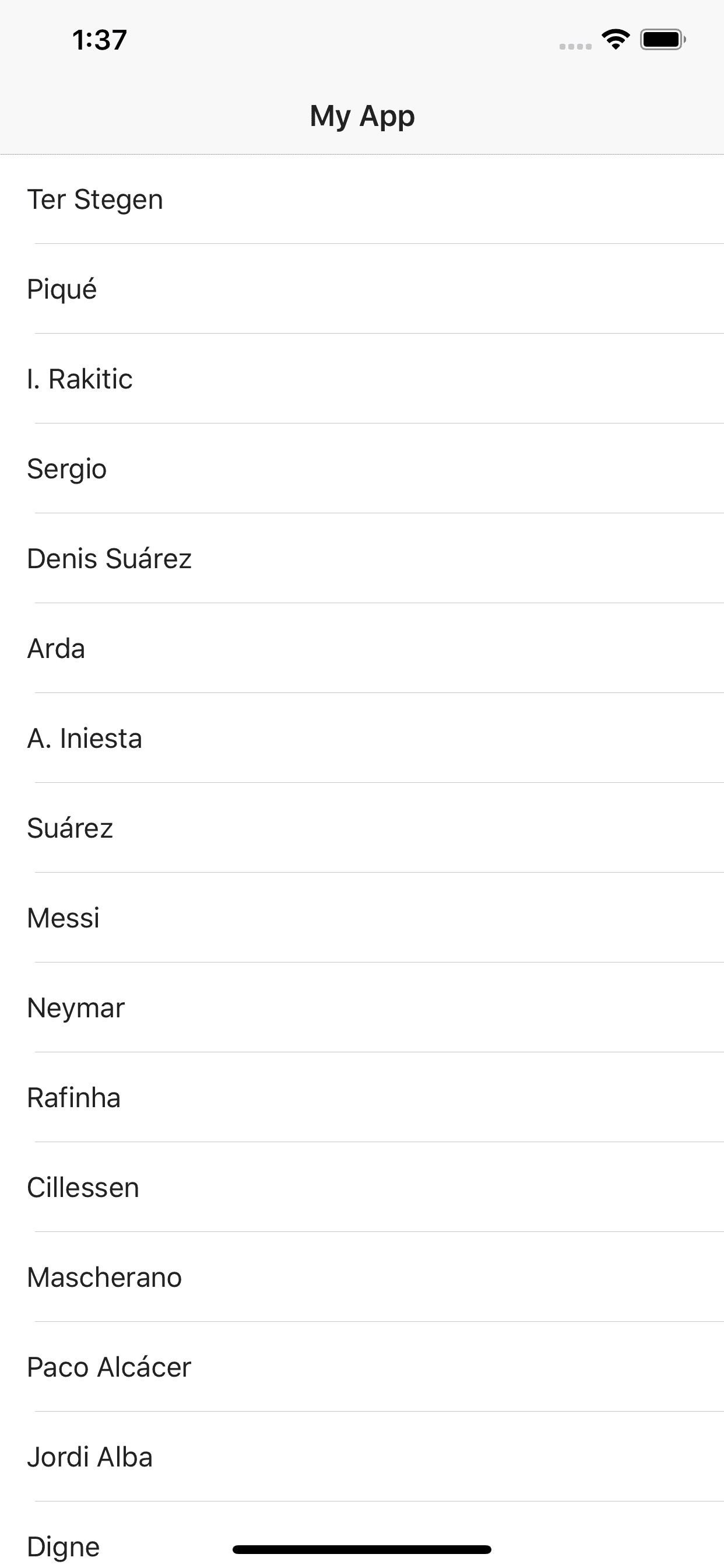
Let’s now change the color of those row items. If we open the items.component.html for that view you’ll notice it has a list-group-item class on it. This class definition is defined from the core theme here.
We could change the text color by putting color="blue" directly on Label if we wanted but more likely we will want a color utility class to be able to colorize anything in our app with this new text color. Let’s add a variable for this new color we are going to start using in our app.
Open scss/_variables.scss and add the following:
$green: #25c761;
Now create scss/_colors.scss to define a nice color utility class we can use anywhere:
.c-green {
  color: $green;
}
We will follow a common naming scheme to prefix the class with c- if it defines just a color we can apply.
Now we want to make sure our new _colors.scss utility classes are included in our setup. Open scss/_index.scss and include them towards the bottom after the core theme utilities:
@import '~nativescript-theme-core/scss/utilities/index';
// our custom convenient additive class utilities
@import 'colors';  // <-- ADDED HERE
@import 'spacing';
Let’s now add that class to the row items:
<ListView [items]="items" class="list-group">
  <ng-template let-item="item">
    <Label
      [nsRouterLink]="['/item', item.id]"
      [text]="item.name"
      class="list-group-item c-green">
    </Label>
  </ng-template>
</ListView>
If you save and look at the app you’ll notice something depressing. The color did not change to green.
Gain control over core theme
This is our most important lesson to understand about the core theme’s setup. The list-group-item class actually contains a color definition on it already and our c-green is not overriding it. As mentioned earlier we don’t have !important with NativeScript. So what is going on?
This case is one of class specific scoping. The core theme defines list-group-item as a scoped class inside list-group as you can see here in the GitHub Repo.
This scoping takes precedence because it’s the most specific.
When we encounter cases like this we may decide to simply turn off the core theme list-view styles commenting out them out from our index:
//@import "~nativescript-theme-core/scss/list-view";
That will make our c-green class show up right away. However you’ll notice another interesting thing here. Somehow the list row items still have padding even though we commented out the list-view classes. So where is that coming from?
This is coming from the core theme’s overrides file which we reference in scss/_overrides.ios.scss - it’s coming from this import:
@import '~nativescript-theme-core/scss/platforms/index.ios';
If we look at those in the core theme here we’ll find that it references a few iOS overrides and in particular a few list-view overrides. If we want fine grain control over these we can expand our scss/_overrides.ios.scss to include the specific pieces we want like this:
scss/_overrides.ios.scss:
@import '~nativescript-theme-core/scss/platforms/buttons.ios';
@import '~nativescript-theme-core/scss/platforms/forms.ios';
@import '~nativescript-theme-core/scss/platforms/labels.ios';
@import '~nativescript-theme-core/scss/platforms/slider.ios';
@import '~nativescript-theme-core/scss/platforms/side-drawer.ios';
@import '~nativescript-theme-core/scss/platforms/switches.ios';
//@import '~nativescript-theme-core/scss/platforms/list-view.ios';
@import '~nativescript-theme-core/scss/platforms/segmented-bar.ios';
Here we expand all the overrides and comment out the list-view.ios override. We leave it commented out here as it’s possible we may want to return to that default override ruleset in the future on this project.
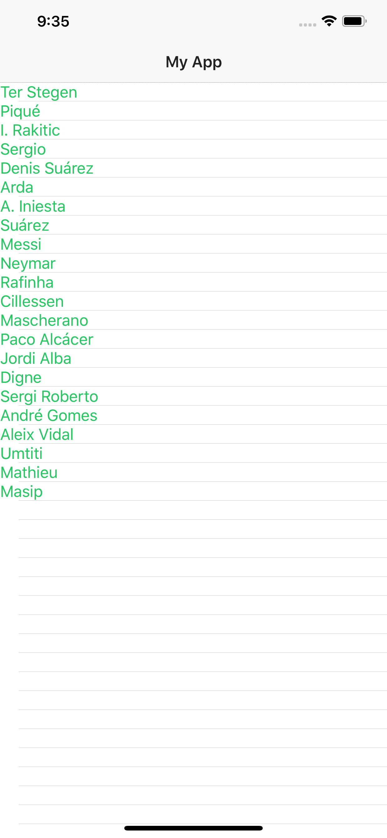
If we run our app now we should see a much more bare bones look which has just our c-green color on the text of the row items now:
Alternatively instead of commenting out the core theme’s list-view styles in our scss/_index.scss and in our scss/_overrides.ios.scss we could keep them and simply use a similarly scoped style to override the color, for example:
.list-group {
  .list-group-item {
    color: $green;
  }
}
This would also work just as well and the bottom line is you have a flexible options to gain control over the core theme by using the SASS it provides in a more à la carte fashion.
Conclusion
The core theme is a great base to build an app on. It offers you the ability to use everything it offers in a pure à la carte fashion providing opportunities to scale nicely from a solid foundation without sacrificing control over all style aspects of your app.

